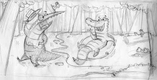
a little bit about my process on this one... along with a few images to help explain it. my initial drawing(see bottom image) was too crowded, too even, kinda boring, etc. etc. thus i turned to photoshop to help me out, where i shrunk the characters within the scene, added a few foreground elements, and stretched the canvas by 25%(a trick learned from barron storey). then i took it into flash and painted it up quick in a flat vector style similar to that of pascal campion (check out his work it's awesome).


posted by coffman at
8:09 PM
![]()

4 Comments:
My friend. If my vectors are nice, your vectors are Lance Burton level. They have magic.
I like the thought process. You really improved the original drawing. You have blessed my eyes, once again, David Coughman.
haha i like it! good work, and you blessed my eyes, too??? hahah
Cluster and Dangle baby! Very nice colors, great shapes and design--awesome as usual!
Now, about that typeface...
Post a Comment
Subscribe to Post Comments [Atom]
<< Home